Hands‑Free Commodity Price Charts with Pure Python

Today we dive into automating commodity price charts in Python using only free packages, transforming raw market data into clear, actionable visuals without subscriptions. Expect practical guidance, tested workflows, and thoughtful guardrails that help you ship reliable dashboards for oil, metals, and agricultural benchmarks while keeping your stack lightweight, reproducible, and completely open.

Free, Reliable Sources for Commodity Data

Before drawing a single line, you need trustworthy data that costs nothing and stays accessible. We will explore Yahoo Finance futures symbols, FRED’s well‑known energy series, EIA’s generous API, and public macro datasets that cover metals, energy, and agriculture, with candid notes on rate limits, update frequency, and the subtle gotchas of unofficial endpoints.

Your All‑Free Python Stack, From Fetch to Figure

Pandas shapes the time series, resamples awkward frequencies, and merges disparate feeds without breaking your index. Matplotlib guarantees reliable static exports for reports, while Plotly lights up interactive candlesticks and tooltips. With numpy handling vectorized calculations, your moving averages, rolling correlations, and z‑scores become fast, testable steps that scale to many symbols cleanly.
Requests keeps HTTP simple and explicit, great for EIA and other JSON APIs. Yfinance and pandas_datareader handle common patterns, reducing boilerplate and silently mapping symbols to endpoints. Fredapi simplifies key authentication and series retrieval, preventing subtle parameter mistakes. Together, these tools cut friction from data acquisition, letting you focus on validation, transformations, and presentation choices.
A tiny schedule loop or cron entry can run fetch and chart tasks at predictable times, skipping market holidays, retrying gracefully, and writing logs for audits. Pair with GitHub Actions for cloud reliability, running nightly jobs that rebuild HTML charts and PNG snapshots, then publish to a static site folder so colleagues always see fresh, consistent visuals.

Chart Designs That Explain Markets, Not Just Display Them

Smoother signals with context and notes
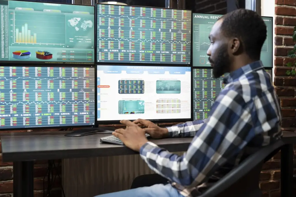
Combine a clean price line with 20 and 50‑day averages, then annotate supply disruptions, policy headlines, or inventory surprises right on the chart. Brief text labels transform raw oscillations into remembered stories, helping non‑quants connect movements with causes and making automation feel human because the machine is carrying forward curated context, not guessing.

Interactivity for fast, focused exploration

With Plotly, candlesticks, rangesliders, and hover labels invite quick inspection of gaps, wicks, and intraday extremes. Pin reference lines for budget levels, add shaded regions for maintenance seasons, and let users toggle series to compare contracts. Interaction reduces clutter while preserving detail, turning one chart into many perspectives that answer questions without extra plots.

Comparisons that matter for decisions

Show Brent minus WTI to spotlight regional tightness, or copper priced in euros to reveal currency‑driven illusions. Normalize multiple commodities to a common index starting point to compare relative performance. These small design choices help purchasing teams, risk managers, and students move from curiosity to action with fewer clicks, less ambiguity, and clearer reasoning.

An End‑to‑End Automation Pipeline You Can Trust

Reliable automation is a chain: fetch, validate, transform, visualize, export, and publish. Design each step to fail loudly yet recover gracefully, with cached data snapshots, timestamped artifacts, and checksum hints. By separating stages, you isolate problems, simplify tests, and create a pipeline that quietly runs before breakfast and rarely surprises your stakeholders.

A daily run that finishes before the inbox

Kick off predawn tasks, fetch yesterday’s close, recompute indicators, and export updated PNGs and HTML. Keep last week’s cache to spot anomalies quickly, and package an index page that highlights deltas since the previous build. When colleagues arrive, their dashboards feel fresh, consistent, and dependable without anyone babysitting scripts or rerunning notebooks.

Resilience when networks and APIs hiccup

Transient failures happen. Implement retries with backoff, temporary fallbacks to cached data, and alerts that include stack traces and the offending symbol. Log response codes and sizes, snapshot raw JSON for audits, and guard downstream steps with preconditions so one flaky endpoint cannot spoil the entire batch or post half‑updated figures publicly.

Publishing that needs no servers at all

Export static PNGs for reports and interactive HTML for exploration. Commit to a docs folder and let GitHub Pages publish automatically. For private contexts, drop artifacts into cloud storage with read‑only links. This keeps operations simple, costs at zero, and encourages contributions because running the project locally mirrors production exactly.

Data Quality, Ethics, and Practical Limits

Free sources empower experimentation, but they also impose responsibilities. Respect rate limits, cite providers, and avoid scraping pages that disallow it. Document units, roll conventions, and holiday calendars to prevent misinterpretation. Build sanity checks that catch impossible jumps, and be transparent about revisions so your audience trusts automated updates as much as manual charts.

Operations saved a weekend of manual screenshots

A supply manager previously captured Friday oil prices by hand, missed a late revision, and circulated outdated charts. After deploying a tiny, free Python pipeline, Monday emails included verified updates with change summaries. The team retired screenshot rituals, gained confidence, and finally used meetings to discuss decisions instead of reconciling numbers line by line.

A roastery protected margin with timely insights

A boutique coffee roaster tracked arabica futures and a currency overlay automatically, receiving alerts when combined moves squeezed margins. Instead of reactive price hikes, procurement hedged earlier and smoothed inventory levels. The charts were simple lines with annotations, yet they aligned conversations across finance and operations, turning quiet data discipline into practical resilience.

Students learned faster with immediate feedback

In a classroom project, learners forked an example repo, plugged in free APIs, and published charts to GitHub Pages. Overnight jobs produced new visuals, and discrepancies became teachable moments. By week’s end, everyone traced metrics from endpoint to figure, gaining confidence and healthy skepticism that sticks long after graduation and first internships.

Join the Build: Share Symbols, Ideas, and Improvements

This project grows best with real‑world needs. Tell us which contracts you monitor, what annotations help your team act faster, and which exports smooth your reporting. Contribute pull requests, raise issues when feeds shift, or request new comparison views. Subscribe for periodic updates, sample dashboards, and curated resources focused on accessible, no‑cost workflows.

Tell us what you track and why it matters

Whether it is diesel at the rack, cocoa for seasonal promotions, or copper for production budgets, your use case sharpens our priorities. Suggest tickers, data series, or overlays that make decisions easier. Real context beats abstract features, ensuring improvements target bottlenecks that frustrate people on deadlines instead of chasing ornamental visual flourishes.

Share dashboards and snippets we can adopt

Have a clever moving window, alert rule, or annotation pattern that clarified a tough conversation with stakeholders. Contribute examples and small utilities others can reuse freely. Even a two‑line helper that standardizes titles or units can reduce friction across dozens of charts and prevent small inconsistencies from snowballing into avoidable confusion later.

Subscribe for steady, practical advances

Get concise notes on new free datasets, plotting techniques that highlight risk without noise, and small automation tricks that survive production realities. We will never spam, and you can reply directly with questions. Together, we can keep improving honest, zero‑cost charting that respects data sources while serving the people making real decisions every day.
Loritunonexozunovirodavopexi
Privacy Overview

This website uses cookies so that we can provide you with the best user experience possible. Cookie information is stored in your browser and performs functions such as recognising you when you return to our website and helping our team to understand which sections of the website you find most interesting and useful.